Getting the idea
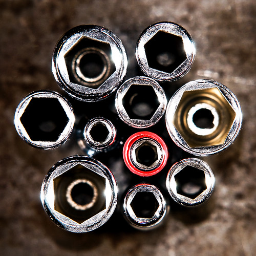
I searched the tool shed and I found a rail of deep sockets. Nothing special about that, but one of the sockets had a red cap and I still don't know why. Either way, I thought it looked as a nice focal point and I wanted to do a high-contrast tool shot.
Setup
I wanted a "grungy" background so I placed the sockets on top of a small toolbox which had a rusty surface. Soft lighting was out of the questions so I snooted a SB-600 and pointed it at the rim of the sockets. I realized that this would create a black area on the other side of the sockets, so I did the same thing on the opposite side.
I wanted to use the Sigma 70-200mm f/2.8 macro lens which has a minimum focusing distance of 1 meter. I had to climb a ladder to get high enough.
Exposure
The Sigma lens is quite soft at 200mm so I had to turn it down to 170mm which is the longest focal length that this lens stays sharp. Focusing at the minimum distance at this focal length gives a very narrow depth of field, so I chose f/8 to stay safe.
Both strobes: 1/64 power, 24mm zoom (SB-600)
Exposure: 1/125 sec @ f/8 ISO 200
Lens: Sigma 70-200mm f/2.8 macro @ 170mm
Camera: Nikon D300
Shooting and processing
Even though I used an aperture of f/8 the slightest movement brought everything out of focus. Using the tripod was unpractical so I took quite a few shots just to be sure that at least one stayed perfectly sharp (or at least as sharp as the Sigma gets....). I also had to re-arrange the sockets a couple of times for a more "tidy" look. From about 15 shots, this was the best (SOOC RAW version):
Once again it was a little bit underexposed, but instead of adjusting the exposure which can lead to increased noise, I increased the brightness in Adobe Camera Raw, and it looked better. In Photoshop I duplicated the background layer, desaturated the new layer and changed blending mode to Overlay. Reduced the opacity to 70%. This gave me a high-contrast look. The red cap faded a little so I brought it back with Selective Color. Adjusted the Level gliders and added a vignette. Finally I cropped it, which was really needed. A square crop is the only way to go with this kind of shape, IMO.
The result:


No comments:
Post a Comment