After I recieved a request for a setup description of my homless photo, I decided to write one. I took a couple of setup shots right after I was finished with the photo, but didn't have time to post a blog entry.
I got this idea when because of the "Christmas Decorations" assignment on dps. I tried to shoot something out of the box, not just a picture of decorations. I wanted story telling too. One day, after I was finished at my job at the airport, I noticed that one of the hangars would be a great way to shoot "on-location" portraits in the winter months. I have also thought about shooting a photo story about homeless people, and somehow I managed to mix these two ideas with the Christmas Decoration assignment.
The setup
Before driving to the hanger, I had to bring some props in addition to the camera gear. So I wrote a list over things that would make the viewer instantly recognize the situation (Christmas and homless) in the photo. This is the list:
Clothing:
- blue nylon jacket
- sweater with hood
- worn-out shoes
- worn-out jeans
- cap
Props:
- empty plastic bottles
- cardboard
- pillow
- plastic bags
- cardboard box
- loads of Chritmas decoration
- crutch
- quilt cover
- paper cups
- "Merry Christmas" card
The only thing I thought was missing was a shopping cart.
I was supposed to bring all this stuff in addition to the photo gear to the hangar, while the wind was blowing up to 60 knots. I had to walk about 50 meter between the hangar and the car, so I didn't look forward to this task. I was very close to giving up, but I thought my idea was too good to let go, so I was determined to continue.
After arriving at the hanger with all the gear safely inside, I got a very pleasant surprise. On one of the shelves I found a shopping cart look-alike. I think it was a trolley that the cleaning staff use, but it looked more than OK for the project.
I started to arrange the setup in one of the corners. It was a very elaborate job to get that look I had in mind. With the Christmas decorations it almost felt like I was decorating a tree. After about 30 minutes of fine tuning, I got this:
(After I shot the picture above, I added the bag, bucket and the cardboard box. I also found an old vacuum cleaner with some appropriate colors which I placed by the wall.)
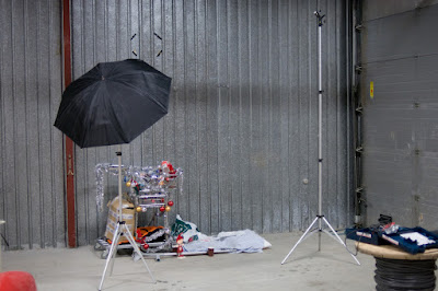
The light setup was pretty simple. Inspired by Dave Hill and Jill Greenberg I wanted to shoot a kind of subtle "artistic" photo, so I planned to use bare strobes. However, after some test shots, I realized I had to use an reflective umbrella to light up the trolley, since I got too many harsh shadows from that strobe. (It was too evident that it was an arranged picture). This is how the final setup looked like:
I attached the camera to the tripod and started adjusting the exposure.
Exposure
There were a lot of grey tones in the scene, so was just adjusting the flash power equally on both strobes until I got a clean histogram with a peak on the middle. The light in the hangar was pretty warm and ugly, so I used minimum sync speed for the shutter to block it out, while using a narrow aperture to get most of the things in focus.
Final exposure settings:
Bare strobe: SB-600, 1/8 power at 24 mm
Umbrella: SB-600, 1/4 power at 24 mm
Exposure: 1/250 sec @ f/8, ISO 200
Lens: Nikkor 50mm f/1.8D AF
Camera: Nikon D300
Flash sync: Optical with SB-800
Shooting and processing
I tried a lot of different poses for this shot. I was uncertain how to behave. I tried laying down while sleeping, sitting with my head hung down, and looking at the trolley. It was a lot of walking back and forth. I had to trigger the 20 sec timer for each shot, so I got a great leg exercise out of it. Finally I found that the looking tired and unhappy at the camera was the best. I looked dead in the other poses.
This is the best shot, unedited RAW file:
In Adobe Camera Raw I increased the clarityto about 50, the vibrance to about 20 and corrected the white balance. Luckily, the exposure was spot on.
In Photoshop I did this:
1. Duplicated the background layer and changed the blending mode to Soft light.
2. Added a high-pass filter (radius 44) on the Soft light layer and reduced the opacity to 70%. This created the slightly artistic look.
3. Used Surface blur on the Soft light layer to even out the surfaces while preserving the edges.
4. Lowered the master saturation a little while increasing the reds to make the decorations stand out.
5. Cropping, vignette and sharpening.
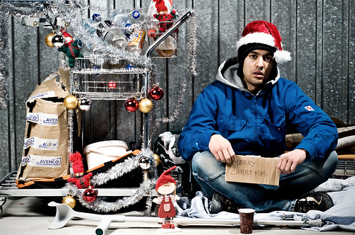
This is the result:


